Travel with an organizer
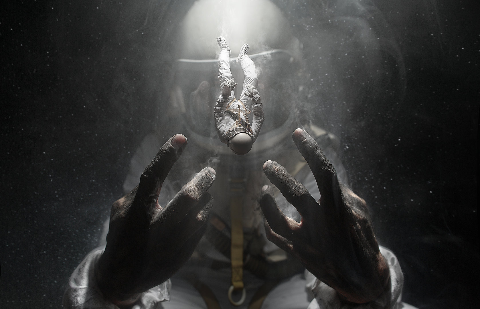
Coming to any country with a workshop, only an organizer is needed. An organizer is requested for each city or country where the master class takes place.
Photography began as a more convenient form of self-expression than drawing or painting, and that shift still shapes how the work on this site is made. Instead of chasing a brush or a palette, the camera offered a way to notice the world and record it, which is why the archive here grew from an artistic education in architecture and a childhood spent observing the streets of a small town. The frames collected below are less about equipment and more about attention, composition, and the patience required to let a scene settle before the shutter falls.
The journey from an early point-and-shoot purchase to a full-frame body with serious glass was gradual and expensive, marked by scores of photographs taken simply for the pleasure of learning. Workshops and tutorials offered along the way were designed for people at any stage, from those opening an image editor for the first time to those already building a portfolio for social networks and print. The teaching philosophy is practical: understand the light, control the depth of field, then build a body of work that carries a consistent artistic idea.
Beyond the archive, the site functions as a portfolio, a tutorial space, and a shop, all built by hand rather than assembled from templates. Master classes and seminars travel to different cities and countries, and most sessions need only an organizer, a room, and an audience willing to spend a few focused days learning how a photograph is conceived, shot, and edited. Travel arrangements for the instructor are handled directly, so groups can request dates that fit their own schedule rather than the other way around.
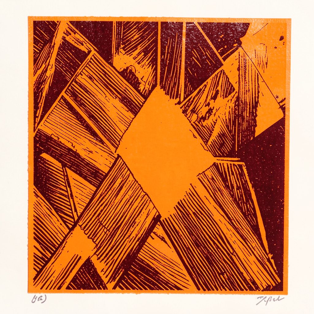
The visual approach follows the same restraint as the teaching. Soft muted blue and deep navy sit against warm off-white and cream, with terracotta-orange accents reserved for the craft imagery and burnt-gold small caps marking each section. Typography stays sans-serif and friendly, spaced generously so that the page feels calm and open. Layout relies on flat color-block transitions, softly rounded photo frames, and one thick navy mat around a featured image, giving the work room to breathe rather than surrounding it with clutter.